


Bold interiors are back but this time, they are playing it smart. Rather than splashing dramatic shades across entire walls, homeowners are increasingly drawn to a more considered approach: placing color in unexpected, partially concealed spots to create intrigue and visual depth. The result? Rooms that feel layered and intentional without being overwhelming.This technique has a name, the “peek-a-boo” paint trend and it has been gaining traction across social media feeds and interior design circles alike. As the appetite for affordable, design-led home updates grows, more people are discovering that a pot of paint and a well-chosen corner can go a long way.According to a 2026 study published in the Journal of Environmental Psychology“Targeted color placement within architectural elements significantly enhanced perceived depth and spatial layering without increasing visual overload.” This directly validates the peek-a-boo concept where using color in specific, contained areas (like alcoves or shelving backs) can make a room feel more layered and visually interesting without overwhelming it.Read on as we break down how the peek-a-boo trend works, where to use it and how to get it right the first time.
What is the “peek-a-boo” paint trend?
At its core, peek-a-boo paint is about strategic restraint. Rather than committing to a bold feature wall, the technique involves introducing a striking shade in areas that are only partially visible, like the back of a bookcase, the inside of an alcove, a door frame or the trim behind a radiator. The color reveals itself gradually, catching the eye from certain angles and adding a sense of discovery to the space.A 2026 Frontiers in Built Environment study found, “Subtle visual variation and partial concealment of design elements increased user curiosity and prolonged visual engagement within interior environments.” This backs the “surprise element” of peek-a-boo paint. When color is partially hidden and revealed gradually, it creates curiosity and discovery, making spaces feel more dynamic and thoughtfully designed.

Interior experts break down the “peek-a-boo” technique and the mistakes to avoid
Dr Eleni Nicolaou, Art Therapist and Creative Wellness Expert at Davincified, a US-based premium platform that blends personalized art experiences with creative wellness, shared, “Think of it as adding a surprise element to your interiors. The color is not shouting for attention but it is waiting to be noticed. That subtlety is what makes it feel so refined.”This sets it apart from the traditional feature wall, which places bold color front and centre. Peek-a-boo paint works with your existing decor rather than competing with it, making it a far more versatile option for a wider range of homes and styles.A 2026 study in the journal Color Research & Application (Wiley) revealed, “Moderate exposure to saturated accent colors improved visual interest and emotional engagement, particularly when contrasted against neutral backgrounds.” This supports the idea that bold color works best in controlled doses. The peek-a-boo trend leverages contrast, bright accents against neutrals, to create impact without fatigue.
Why is this trend taking off now?
A few things have combined to make this the right moment for peek-a-boo paint. The rise of maximalism has encouraged homeowners to be bolder with color but many are still wary of going all-in. This trend offers a middle ground, color confidence without the full commitment. With more people living in rented spaces, there is also demand for updates that are easy to apply and just as easy to reverse.

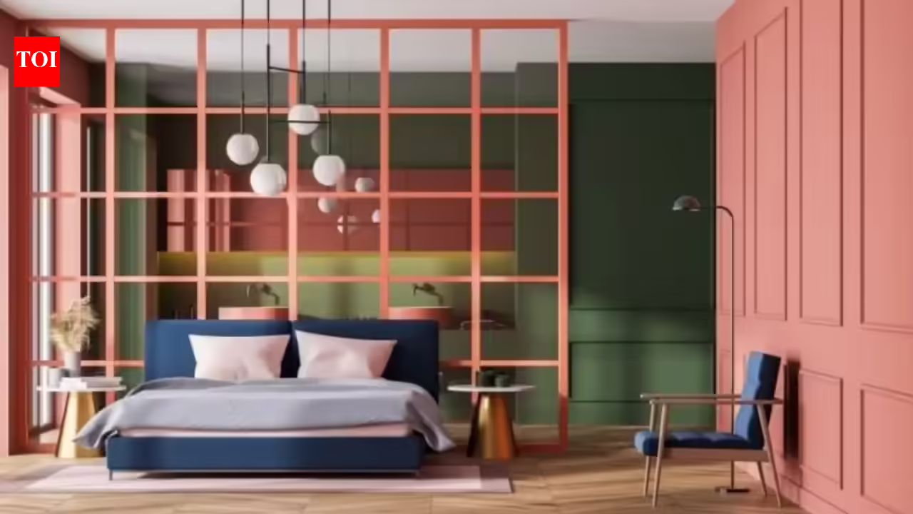
How the “peek-a-boo” paint trend uses cleverly placed color in alcoves, shelving backs and door frames to add depth and personality to a room.
“Social media has given people a much broader visual vocabulary when it comes to interiors,” Dr Nicolaou noted. “They’re seeing how small, intentional design choices can completely change the feel of a room, and they want to try it themselves without taking a big risk.”
Where to use peek-a-boo paint in your home
Part of the appeal is just how many spots it works in. Here are some of the most impactful areas to consider –
- Behind Shelves or Bookcases: Painting the wall behind open shelving in a contrasting shade instantly frames your displayed items and adds depth to the whole unit, striking but still largely framed by the shelf itself.
- Inside Wardrobes or Cupboards: A bold interior color inside a wardrobe or kitchen cupboard is completely hidden when closed, but adds a moment of delight every time you open the door.
- Around Door Frames or Skirting Boards: Painting door frames or skirting boards in a contrasting color draws attention to the architecture of a room in a way that feels considered rather than accidental.
- Stair Risers or Under-Stair Spaces: Stair risers are an underused canvas. A bold color here adds personality to a hallway without touching the walls at all.
“The areas that create the biggest impact are usually the ones people tend to overlook,” said Dr Nicolaou. “A painted alcove takes maybe an hour but it changes how the whole room reads.”
The best color combinations to try
A few pairings that consistently work well:
- white or off-white with emerald, navy, or terracotta for a clean, striking contrast
- tonal layering using different shades of the same color for a more cohesive, sophisticated result
- warm neutrals paired with cooler accent shades like slate blue or dusty lilac for a quietly dynamic feel
“Look at what’s already in the room and work with those elements,” Dr Nicolaou advised. “The accent color should feel like it belongs there, not like it was added as an afterthought.”
Common mistakes to avoid
Dr Nicolaou said these are the things you should avoid to make the most of this trend –
- Overusing the Effect: If every alcove and door frame is painted in a contrasting shade, the impact disappears. Pick one or two spots per room and let them do the work.
- Ignoring the Lighting: Always test a paint sample in the actual spot before committing, and check it at different times of day.
- Using the Wrong Finish: Eggshell or satin tends to be the most versatile for this technique. A high-gloss finish in a living room accent spot can look rather cheap than considered.
“The difference between peek-a-boo paint looking intentional and looking like a mistake often comes down to the finish and the placement,” said Dr Nicolaou. “Get those two things right and the rest tends to fall into place.”Peek-a-boo paint works best when used with intention. The temptation, once you see how effective it can be, is to apply it everywhere but that’s where the magic starts to fade. Choose one area, commit to it and let it breathe.Dr Eleni Nicolaou concluded with the advice, “If you’re new to using color in your home, this is a great place to start. Painting the back of a bookcase or the inside of an alcove is low-stakes, costs very little and can always be painted over but the impact is often far greater than people expect. Start small, trust your instincts and don’t be afraid to experiment.”