
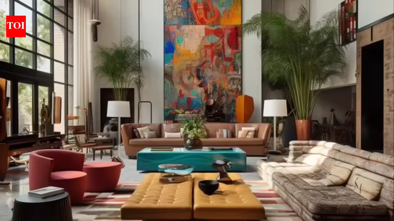

You have rearranged the furniture. Swapped out the cushions. Maybe even splashed out on a new rug but your living room still feels a little off? If it is unsettled, cluttered or just hard to truly relax in; the problem might not be the layout. It might be the color on your walls.Color has a powerful effect on how we feel in a space, often in ways we do not consciously register. According to experts, one color in particular is doing a lot more harm than most people realize.Read on as we break down why this color can turn a living room from a sanctuary into a source of stress and which colors to reach for instead.
The color that creates chaos
Bright, saturated red might look bold and confident on a mood board but living with it is a different story. In an interview with the Times of India, Dr Eleni Nicolaou, Art Therapist and Creative Wellness Expert at Davincified, a US-based premium platform that blends personalized and therapeutic art experiences with innovative design, shared, “Red is one of the most physiologically stimulating colors there is. It activates the nervous system, raises heart rate and signals alertness, which is great in certain contexts but the opposite of what you want in a room designed for rest.”This is not just aesthetic preference. Research into color psychology consistently links high-saturation reds with increased arousal and stress responses. In a living room, that kind of visual intensity can work directly against relaxation. Saturated red also advances visually, making walls appear closer and rooms feel smaller than they actually are.

Is Your Living Room Red? Experts Warn It’s Making You STRESSED
According to a recent 2026 study published in Environment and Behavior“High-saturation warm colors, particularly red, were associated with significantly elevated heart rate and sympathetic nervous system activation compared to low-saturation tones.” This directly validates that red activates the nervous system and links color choice to measurable physiological stress, not just perception.
Where it tends to go wrong
A full red room is rarely the issue. Often, it is subtler and that is exactly why it catches people off guard. “An accent wall is one of the most common places I see red used with the best intentions,” said Dr Nicolaou. “But a full wall of bright red doesn’t recede into the background; it dominates. Your eye is constantly drawn to it, which creates a visual restlessness that’s hard to switch off.”The same applies to large red sofas, deep crimson rugs or bold decor pieces placed at eye level. Individually or combined, they can tip a room from lively into overwhelming.A 2026 Journal of Psychology Environmental study found, “Participants in red-dominant environments reported higher levels of mental fatigue and reduced ability to relax, indicating increased cognitive load.” It shows that red interiors can make spaces feel mentally tiring and harder to unwind in and reinforces that living rooms feel “off” despite design changes.
Colors that calm
There are plenty of colors that bring personality to a living room without overstimulating the brain or going back to magnolia.
- Soft Blues: Softer, muted shades like dusty slate or pale teal rather than bright cobalt lower perceived tension and make a room feel open. “Soft blue creates a sense of space without feeling cold,” said Dr Nicolaou. “It’s a color that lets the nervous system settle.”
- Muted Greens: Sage, olive and muted forest tones carry a natural association that most people find instinctively grounding. “Bringing those tones into a room, even through paint or soft furnishings, can replicate the calming effect of being around greenery,” Dr Nicolaou explained.
- Warm Neutrals: Soft creams and warm whites create a sense of ease that more saturated colors rarely achieve. “Warm neutrals are far from boring,” noted Dr Nicolaou. “The right shade makes a space feel homely and cozy.”
- Earthy Terracotta and Beige: For warmth without intensity, earthy terracotta and soft beige offer the richness of red’s warmer tones without the overstimulation. “They feel lived-in and comfortable,” said Dr Nicolaou, “which is exactly what a living room should be.”
A 2026 study in Frontiers in Psychology established, “Warm, saturated hues such as red were consistently perceived as advancing, making spaces feel more enclosed, while cooler and muted tones enhanced perceived openness and calm.” The study backs the claim that red makes rooms feel smaller and more intense and supports recommendations for soft blues, greens and neutrals as calming alternatives.
How to use color practically
If red is a color you love, the key is scale. Cushions, artwork or small decorative objects can bring energy without the visual noise of a large red surface. For calming colours, pairing them with natural materials like linen, wood and stone adds texture and interest. “Colour doesn’t have to be all-or-nothing,” said Dr Nicolaou. “It’s about being intentional with how much visual weight each color is carrying.”

Is the Color of Your Living Room Making You Anxious? The Surprising Culprit Revealed
Color is an excellent way to shape how a space feels yet it is often the last thing people consider when a room is not working. Bright, saturated red is a common choice for people who want to make a statement but it can quietly undermine the very thing most of us want from a living room: a place to switch off.Dr Eleni Nicolaou revealed, “The colors around us affect our nervous system, whether we’re aware of it or not. Choosing shades that support calm, like soft blues, muted greens and warm neutrals, doesn’t mean sacrificing style. It means being thoughtful about the emotional experience you want your home to create. Even small changes, like swapping a bold accent for a softer tone, can shift how a space feels entirely.“